Fact: People like to push my buttons.
Really, they’ve told me.
But, as a marketer, I can’t really complain.
A great deal of my job is focused on getting people to push my buttons — well, click our calls-to-action (CTAs) to convert.
In turn, this usually requires pushing the right buttons with them – appealing to their interests, motivations, and concerns, but it can be a difficult dance.
Have you struggled to get your audience to take the action you want? Maybe it’s signing up for your newsletter on your website or clicking through on an email to buy your newest product.
If so, it time to revisit your calls-to-action.
How to use calls-to-action for lead generation
Calls-to-action can be used in many different places: on your website, in an email, at the end of a blog article.
Regardless of the location, however, the goal is the same: Get the viewer to click.
Not only does they have to be visually appealing and prominent, the content has to be persuasive as well.
We could write a full textbook on how this is done, but when it comes to calls-to-action, these best practices are most noteworthy:
- Make them action-oriented
- Use the first-person
- Include strong visuals
- Create a sense of urgency
- Eliminate objectives or friction
- Make them stand out and easy to find
To best set up your calls-to-action to generate leads, you also need to remember the buyer's journey.
If the call-to-action you’re adding doesn’t fulfill the need of the user at th specific point in their journey they’ll be encountering it, it’s not going to resonate with them, and they’re not likely to move forward.
For example, if someone has just discovered your brand and is on your about us page (the awareness stage, if you will) , but gets hit with a CTA asking them to buy now. They’re just getting to know you; this is jumping the gun.
So, always think twice about what stage your buyer may be in when they encounter your button.
Then, use these 18 call-to-action examples to inspire your next design.
1. AppleTV+: “Watch Now”
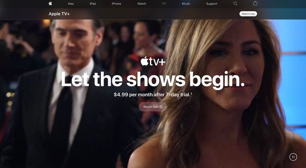
For its new streaming service AppleTV+, Apple uses the call-to-action “Watch now” paired with a play icon to move visitors towards signing up.
This is a great idea because it speaks directly to the interests of the visitor in that moment (watching some of the exclusive content being shown in the background), but it’s also a bit misleading as you don’t actually go straight to watching.
Instead, you are taken to a sign-up page with another CTA to start a free trial. This creates a bit of a frustrating user journey and could rub some people the wrong way.
If I were Apple, I’d immediately take them to the free trial form or even better to the opportunity to begin watching a show before being prompted with a form.
2. Netflix: “Try 30 Days Free”
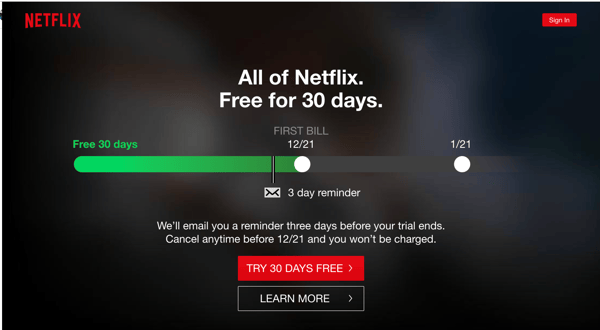
On the other end of the streaming spectrum, Netflix doesn’t play games with its CTA. It uses a striking, on-brand red button to attract your eye then uses its free trial to remove the friction of not knowing what you’ll get in to.
It also does a good job of addressing other common concerns right there next to the button, eliminating any other objections.
3. Lyft: “Ride and Save”
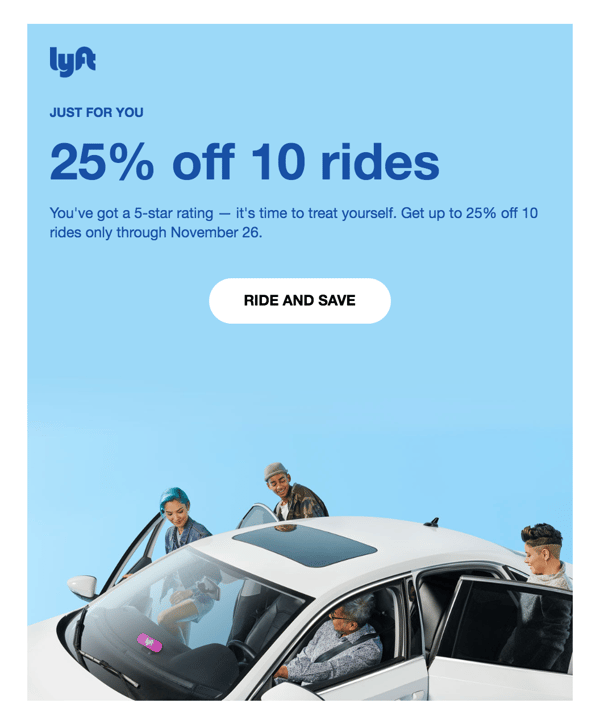
In this email call-to-action, ride sharing company Lyft cuts right to the chase. What is it offering you? Rides — but if you click right now, you’ll also save.
Between this simple copy and the use of negative space around the button to draw the eye, this CTA is well-staged to attract leads.
4. Canva: “I’m in! Show me Canva 2.0”
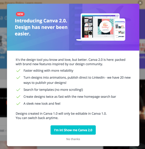
In another awesome email CTA, Canva makes smart use of detailed, introspective copy to let the viewer know exactly what they’ll be getting when they hit the button.
It also creates a sense of community and exclusivity suggesting that you’ll be “in” on something when you click through.
5. Chick-fil-A: “Find your morning motivation”
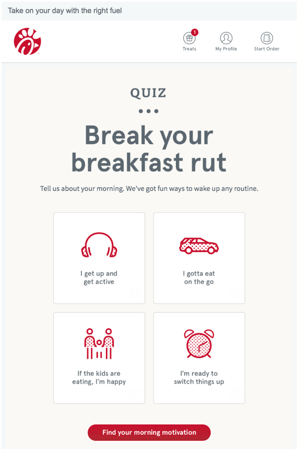
Rather than flat out telling you to view its breakfast menu, Chick-fil-A positions its food not as a mere hunger cure but as “motivation” in this clever CTA copy.
It also gamifies the experience by putting it behind a personality quiz.
By clicking through, you’re not just seeing what they’re selling, but learning about yourself. Plus, with its bold use of the brand’s signature red, this CTA is impossible to miss.
6. WordStream: “Grade My Account For Free”
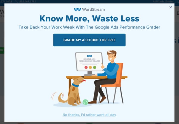
In this pop up, WordStream gets specific about what they’re offering and uses first-person copy to get into the visitor’s head.
Similar to Netflix, they also make it a point to state that the offer is free, eliminating any friction someone might have about being “sold.”
7. Hotjar: “Try it free”
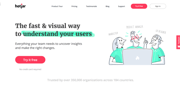
Hotjar’s homepage features two calls-to-action leading you to the same place.
Both are easy to find with their placement and bright red color and also reduce friction by giving visitors the option “try” before buying. They’re not going in for the hard sell.
8. Spotify: “Get Spotify Free”
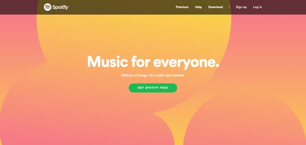
Spotify’s brand and marketing hasn’t changed much over the years, and with good reason — it works. One of the few things that has changed is its conversion strategy.
A few years ago, Spotify would feature two competing CTAs — one leading to Spotify free and the other to their premium tier — but as you can see here, the team is now focusing solely on driving people to its freemium.
Between its simple, direct copy, bold color, and prominent placement, this CTA is just waiting to be clicked.
9. Trello: “Sign Up — It’s Free!”
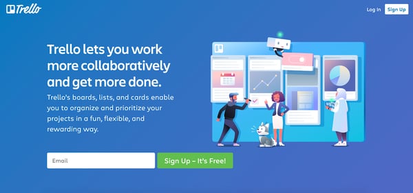
Trello makes their persuasive copy and button text stand out against their all blue background by featuring strong contrasting colors and keeping the page simple.
There’s nothing to distract you from what they want you to do next -- sign up for free.
10. Social Media Examiner: “Click to Save!”
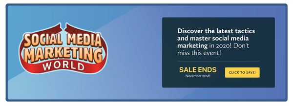
In most instances a CTA that leads you to making a purchase can come off as aggressive or off-putting, but by leading with the savings, Social Media Examiner makes this yellow button something people want to click.
Do I want to buy now? Maybe not. Do I want to save? Always.
11. World Market: “Shop the room”

Here we have an email banner CTA from retail store World Market. In a similar strategy to Chick-fil-A, the company repositions a rather mundane action of shopping and makes it sound exciting with its copy.
You can shop now or you can shop for the furniture in the beautiful room you recently saw in a TV movie. Which is more likely to pique your curiosity?
12. Join.Me: “Start Meeting”
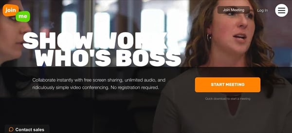
Join.Me makes it easy for you to immediately get started with this call-to-action.
Nothing is worse than waiting what seems like hours for a meeting to start.
Join.Me’s text understands this pain, making the idea of starting the meeting right now that much more enticing. Paired with its bright orange color on a dark background, this CTA is built to grab your eye.
13. Influenster: “I want more boxes!”
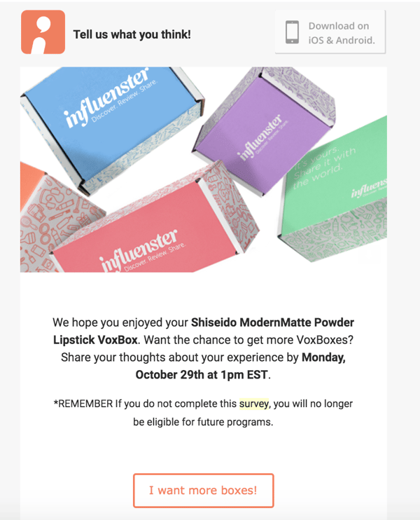
For those of you not familiar with it, Influenster is a community that sends members free products to review and try in exchange for sharing how they feel about them in a survey and on social media and online stores.
As a member for nearly six years, I know the excitement of getting chosen for one of their campaigns all too well, and the team capitalizes on that with this CTA.
By click through, I’m not just completing a mandatory survey, but guaranteeing that I’ll be considered for future campaigns. Click, click, click!
14. theSkimm
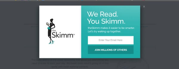
theSkimm lets you know exactly what they offer in this pop-up CTA, but makes it even more appealing by pairing it with strong social proof.
Not only does this create a sense of belonging and community, but it also helps support the company’s claims.
15. Charity Water

I’ve always been a fan of charity:water’s marketing, and this a perfect example of why.
The Spring is a group that regularly donates money to the non-profit to help it deliver clean water to those in need around the world.
But with this bold green CTA you’re not just donating to a cause like you could anywhere else, you’re joining a movement that will change the world.
Between that, the moving copy, and the rich photo of a smiling child, it’s hard not to click.
16. Ugmonk
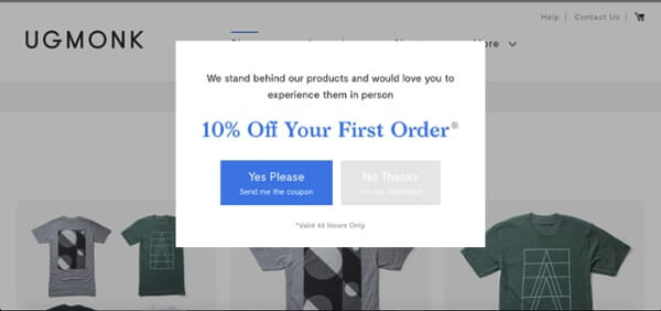
In this exit-intent pop up, Ugmonk gives visitors the option to get sent a 10% off coupon or leave the site.
It makes the option it wants you to click (yes!) most prominent with its blue coloring (that matches the value proposition above) and creates a sense of urgency by making the offer only valid for 24 hours.
Another smart move is making the user actively choose “Yes” or “No.” This forces them to really think twice and ask themselves if they really want to let the deal go.
17. Hello Fresh
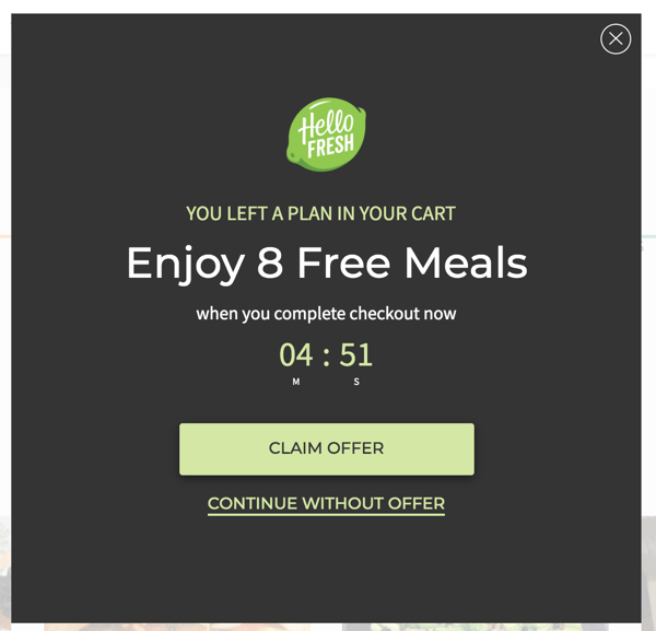
In a similar approach, HelloFresh urges new prospective users to convert by offering them a compelling deal right off the bat. You can “claim the offer” of 8 free meals or go about your business without them. Why wouldn’t you click
Clicking with your audience
These companies all use CTA best practices that have been proven to generate results and leads for marketers, but no two audiences are alike!
Finding copy or designs that click with your audience may take a few tries, so always make sure to test different options.
HubSpot and Optimizely make doing this easy for users, but even without a sophisticated tool you can experiment with different options and pay attention to whether or not your clicks increase or decrease.
With that and these examples in hand, you’ll be pushing all the right buttons before you know it.
from The IMPACT Blog https://ift.tt/2P1dPh4
via IFTTT
Comments
Post a Comment