Did you know that a single webinar can generate over 1000 leads?
When a properly planned and executed webinar is in place, it can increase your customer loyalty to up to 60%.
A webinar landing page is a hub for your leads to learn, understand, and give in to your sales pitch that you're providing solutions to their problems. This is where the first impression counts. You either hook your prospects in or lose them as they close your webinar landing page tab.
When creating your webinar landing page, here's a list of features that you'll need to attract higher conversions.
1. Hammer Down on All the Pain Points of Your Visitors
The number one mistake most designers make when crafting a webinar landing page is that they focus more on them than attendees' needs. People don't sign up for webinars to only learn from you unless you're Tony Robbins, Gary Vee, or Tai Lopez. They sign up because you can provide them with a solution to their problems.
They want an answer to why their sales are low and how to improve them. They want to know how to increase, show up, and make the most of what they have to offer. An excellent landing page design hammers down on all the pain points that your visitors have and show them why they need to sign up to get their magic solution.
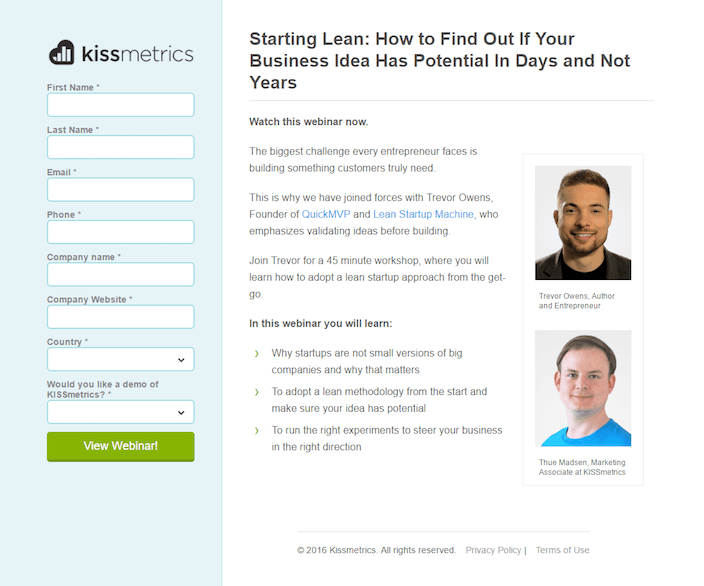
Your viewer's pain points and solutions shouldn't only be used in the heading, but it should also be in the description, email campaign, and all your digital collateral.
Here are some guides that can you craft the perfect headlines and copy for your webinar landing page:
- What Brand Storytelling Is & How To Do It (With Examples!)
- The 7 Step Conversion Playbook To Quickly Optimize Your Landing Pages
- How To Lead Prospects Further Down The Conversion Funnel
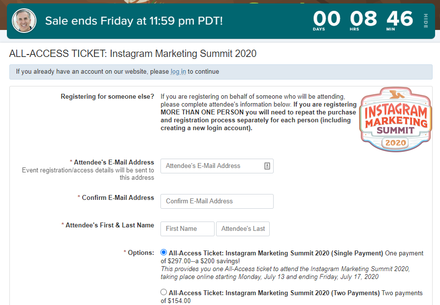
2. Add Elements that Push a Sense of Urgency
We know that it's a good practice to announce your webinar at least 2-4 weeks ahead of its launch date to give people time to sign up. Oddly around 35% of attendees sign up 1 to 7 days before the webinar.
Instead of waiting for sign-ups, add features that will push a sense of urgency like a timer.
The countdown is a classic urgency tactic, used by a lot of big brands who want to push sign-ups days ahead of launching. There are two approaches to using a countdown timer.
The first tells users they only have a certain amount of time to take action. The second is to use a timer to count down a free offer/access to grab your website visitor on the first go!
3. Add Stunning Images of Speakers
Images are essential for increasing webinar landing page conversions. Images help to evoke emotion, enhance the user's experience, and decrease bounce rates. But why?
It's a simple fact that humans are visual creatures. Humans process 90% of visuals much faster than text, as well as remembering text 89% more when associated with an image.
To find the best image for your webinar landing, you need to find out what your prospects state of awareness is and what image provokes can provoke an emotion while transmitting a powerful message.
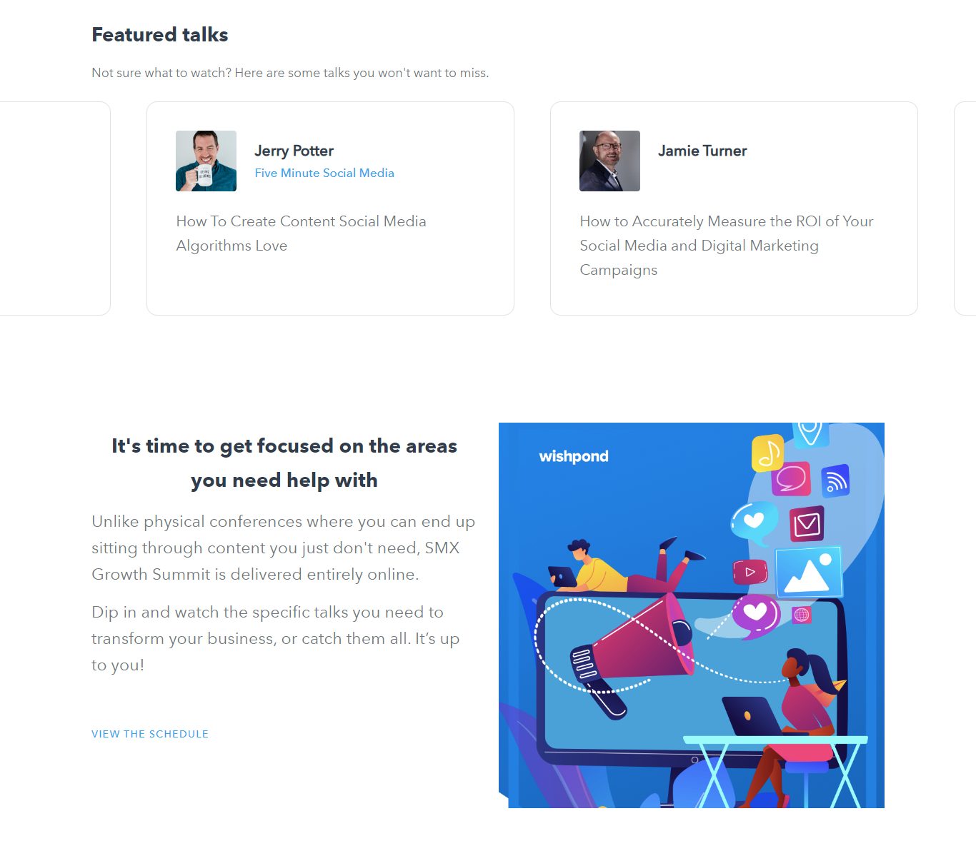
That's where your speakers come in. Adding the images of your webinar speakers conveys a strong representation of your webinar's credibility. It shows that you're providing the best expectations that your attendees can learn from, and who they can expect to see.
This also adds a human element to your webinar. People trust people, when you show people who are similar to your target audience, this allows them to feel more connected to your brand instantly.
4. Make Your CTA Unmistakably Noticeable
Sometimes we're so focused on adding the right information to our webinar pages that we forget to make our CTA the most noticeable item on our landing page. Your CTA must be unmistakably noticeable.
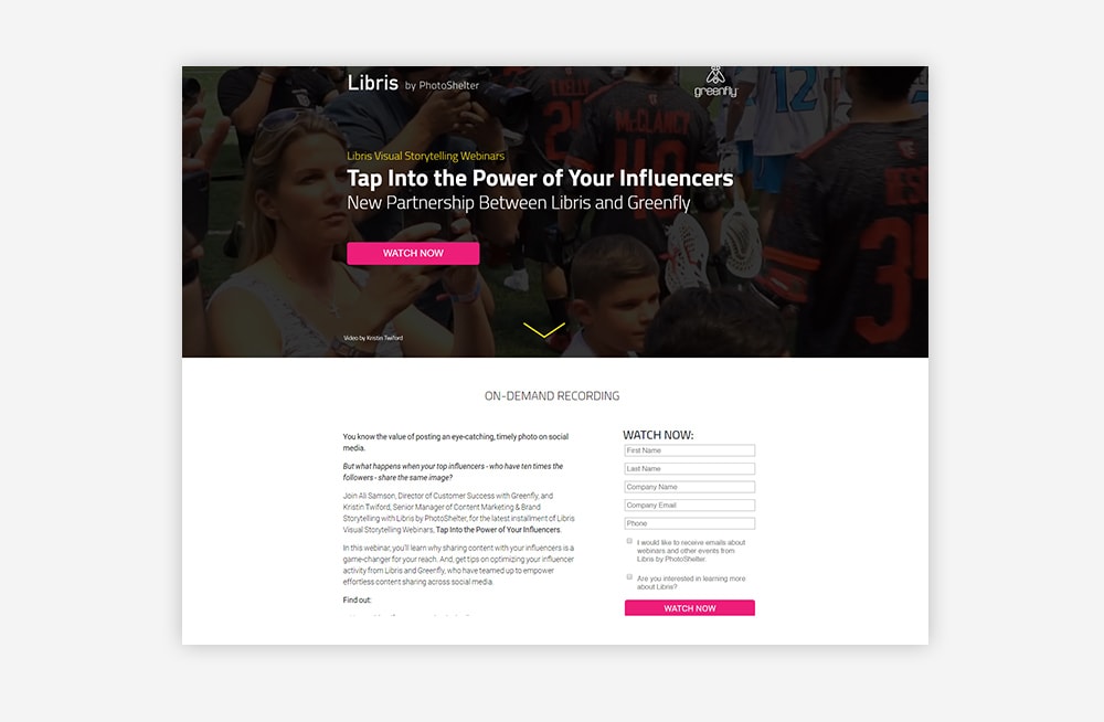
The perfect webinar CTA has the following elements:
-
Power Words or Provoke Action: They help to tell the person in under 3-5 words what they should do on your page and where they should click. CTAs drive conversions and generate leads, and it's one of your most influential webinar landing page features. If your webinar CTA button doesn't grab potential leads' attention, you could be making one of these CTA mistakes that might be killing your conversions.
-
The Right CTA Color: It should be the most contrasted feature on your webinar landing page. When leads take a look at your webinar landing page, your CTA shouldn't blend in with the rest of the text, banner, or color. It should be the boldest color to catch your reader's eye automatically. Pick bright colors like red, orange, blue, yellow, or green.
-
Placed in Multiple CTA:: Ensure to place more 2-4 CTA buttons or options on your page. One on the top and another on the bottom. This allows leads to sign up without scroll or searching on your page easily. Lastly, no matter what your lead is looking at, your CTA will effortlessly be in their view. You can also add a floating CTA, that moves no matter where the viewer scrolls as well.
Don't forget to look at these 7 Landing Page Call-to-Action Formulas for Higher Conversions
5. Optimize Your Webinar Landing Page with Pop-Ups
Treat your webinar landing page like any other, by adding lead generating features like landing pages. Please don't leave it to chance that everyone will click your CTA. Sometimes you have to get into your lead's face.
You'll also have to consider the design of the pop-up as well. Simply by adding an image to your pop-up Sleek Notefound that it could increase your conversions by up to 83.57% when compared to those without a picture.
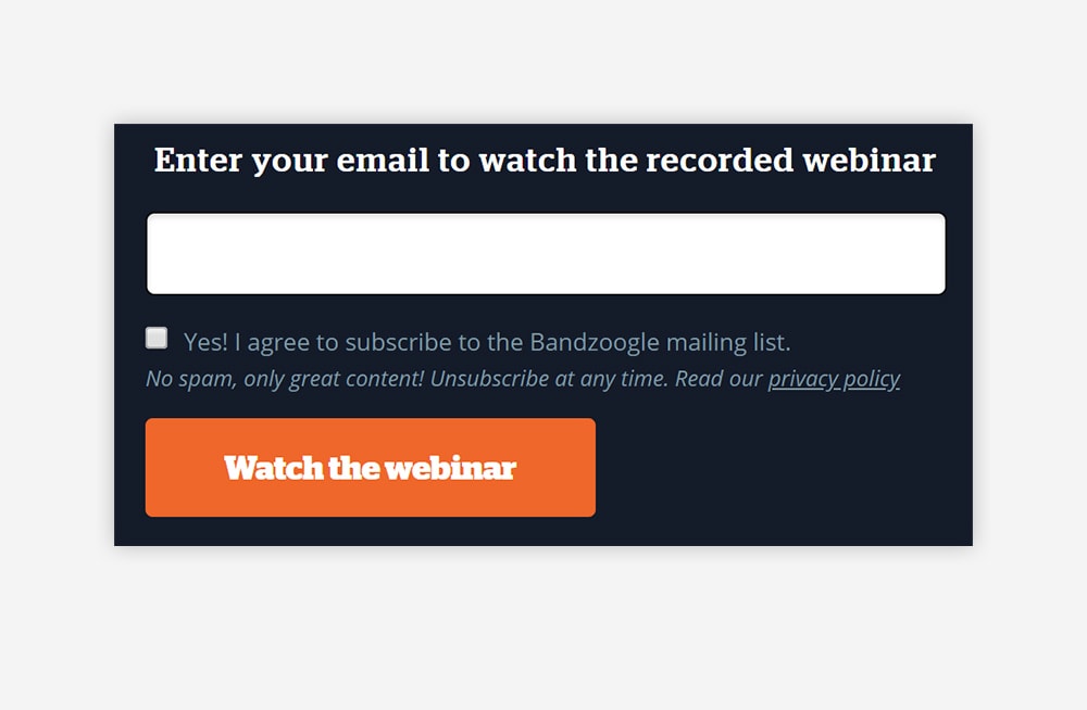
At Wishpond, we helped increase conversions by up to 33% with the help of a welcome pop-up that's triggered when a new website visitor lands on your website, and it fills the entire page with a specific CTA.
Ready to create your next webinar landing page pop-up?
6. Add Share & Social Media Buttons
Adding a share and social media buttons work as a free promotion for your webinar by your newly captured leads. Referrals help to boost your webinar's credibility plus when referred by a friend, and people are 4x more likely to make a purchase.
Not to mention customers acquired through referrals have a 37% higher retention rate, and 81% of consumers are more likely to engage with brands that have reward programs.
You can add sharing buttons to your webinar landing page or give the option to share on social media platforms after signing up!
![]()
7. Optimize Your Webinar with App Integration
Adding the right apps to your webinar landing page can create a seamless workflow for you and your team. Whether it's accepting payments, sending out email campaigns, sales, or analytics, you'll need the right landing page builder to host all your apps.
With Wishpond we offer a wide variety of app integrations with our products, whether it's Shopify, Mail Chimp, Salesforce or more.
8. Add the Option to Add Your Webinar to Their Calendar
Adding the option to add your webinar date to your leads landing page is a sure-fire way for your leads to remembering that they not only signed up for a webinar, but they should attend it as well.
It's the little things that matter.
You can either do an app integration where you allow your webinar host to give sign-ups the option to add it to their calendar. Or you can provide a shareable link with a Google calendar generator.
9. Add Video Content to Your Webinar Landing Page
Adding an intro video to your webinar landing page can help to seal the deal with your potential leads.
Including a video on your landing page can boost your conversion rate by up to 80%.
Add a short snippet or teaser video on your webinar landing page, letting viewers know what they can expect and it helps to improve conversions.
After all, 97% of marketers say video has helped users gain a better understanding of their products and services. Maybe that's why around 59% of executives say they would rather watch a video than reading text.
Here's an idea, you could make one of the professionals who'll be speaking at your webinar. Again video is another tool that adds a human element to your webinar landing page that's sure to connect easily with your audience.
10. Always Make Your Webinar Landing Page Mobile Friendly
Mobile-friendly landing pages are your best friends when it comes to increasing conversions for your webinar.
We're constantly on our phone, so why wouldn't your leads be? WebFx found that 61% of consumers say they are more likely to purchase from mobile-friendly sites.
You never know what device leads will be using when they visit your webinar landing page. Take the time to make sure that their user experience is superb on desktop, tablet, or mobile.
Don't forget around 85% of adults think that a company's website, when viewed on a mobile device, should be as good or better than its desktop website.
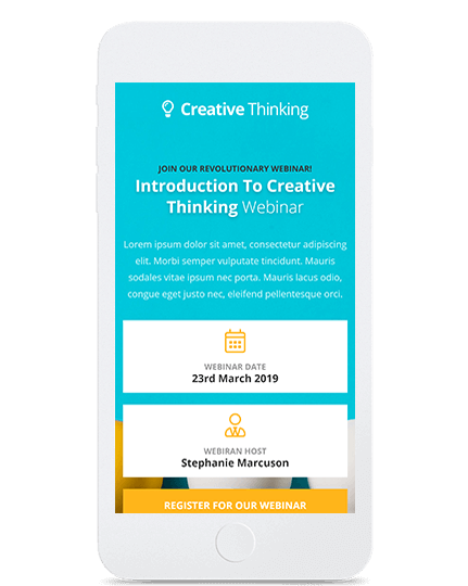
Are you having problems creating a mobile-friendly website?
With Wishpond's "Canvas" you can choose how your landing pages should be optimized for desktop, mobile, or tablet. Canvas allows you to automatically optimize your landing page for any device to keep your landing page looking sleek and organized, every time.
Bonus: Use Wishpond to Track, Segment & Manage Your Leads
Be as focused as you are on increasing webinar conversions, with tracking and maintaining them. The next step to getting the most out of your leads isn't just a follow-up email, but the marketing campaign you send after you've wrapped up your webinar session.
Manage and create automated marketing campaigns for your webinar leads with Wishpond. Wishpond's leads database allows you to create segments of leads and track their activity across your website.
Wishpond's visitor tracking allows you to see the pages your leads are visiting and the campaigns they're converting on, giving you unique insights into their behavior. Use this information to personalize your marketing and sales efforts better.
Easily segment, automate, and optimize your lead generation and management all in one place.
Summary
Webinars are a great way for you to see what your audience is interested in and how you can create more lead generating tactics to keep them hooked. Once your webinar is finished, the real work begins. You'll need to send your leads updates, emails, and offers to turn your webinar attendees into "qualified" leads that will join your customer base.
A quick tip! Never shut down your original webinar landing page. Instead, use the webinar replays as evergreen content to capture more leads, so the next time you update or publish a new webinar, you'll have a ready list waiting to see more of what your brand has to offer.
Creating the perfect webinar landing page comes with experience, A/B testing and these added features listed below:
- Hammer Down on All the Pain Points of Your Visitors
- Add a Elements that Push a Sense of Urgency
- Add Stunning Images of Speakers
- Make Your CTA Unmistakably Noticeable
- Optimize Your Webinar Landing Page with PopUps
- Add Share & Social Media Buttons
- Optimize Your Webinar with App Integration
- Add the Option to Add Your Webinar to Their Calendar
- Add Video Content to Your Webinar Landing Page
- Always Make Your Webinar Landing Page Mobile Friendly
Bonus: Use Wishpond to Track, Segment & Manage Your Leads
I hope you walk away better than you did when you started and feel free to check out our other guides on landing page designs and tips:
- Landing Page FAQ: What's the Difference Between a Landing Page and a Squeeze Page?
- 25 Best Lead Generation Landing Page Designs & Examples for 2019
- 14 Landing Page Design Tips and Tricks for Increased Conversions
from Wishpond https://ift.tt/3fMkkAM
via IFTTT


Comments
Post a Comment